


 Genuine commercial
 Official authorization
 Formal invoice
2 days(Holidays postponed)
Formal invoice
2 days(Holidays postponed)

Font description
To design a text typeface "at the top with, at the bottom without" serifs was an idea which crossed my mind at the end of the sixties. I started from the fact that what one reads in the Latin alphabet is mainly the upper half of the letters, where good distinguishableness of the individual signs, and therefore, also good legibility, is aided by serifs. The first tests of the design, by which I checked up whether the basic principle could be used also for the then current technology of setting - for double-sign matrices -, were carried out in 1970. During the first half of the seventies I created first the basic design, then also the slanted Roman and the medium types. These drawings were not very successful. My greatest concern during this initial phase was the upper case A. I had to design it in such a way that the basic principle should be adhered to and the new alphabet, at the same time, should not look too complicated. The necessary prerequisite for a design of a new alphabet for double-sign matrices, i.e. to draw each letter of all the three fonts to the same width, did not agree with this typeface. What came to the greatest harm were the two styles used for emphasis: the italics even more than the medium type. That is why I fundamentally remodelled the basic design in 1980. In the course of this work I tried to forget about the previous technological limitations and to respect only the requirements then placed on typefaces intended for photosetting. As a matter of fact, this was not very difficult; this typeface was from the very beginning conceived in such a way as to have a large x-height of lower-case letters and upper serifs that could be joined without any problems in condensed setting. I gave much more thought to the proportional relations of the individual letters, the continuity of their outer and inner silhouettes, than to the requirements of their production. The greatest number of problems arose in the colour balancing of the individual signs, as it was necessary to achieve that the upper half of each letter should have a visual counterbalance in its lower, simpler half. Specifically, this meant to find the correct shape and degree of thickening of the lower parts of the letters. These had to counterbalance the upper parts of the letters emphasized by serifs, yet they should not look too romantic or decorative, for otherwise the typeface might lose its sober character. Also the shape, length and thickness of the upper serifs had to be resolved differently than in the previous design. In the seventies and at the beginning of the eighties a typeface conceived in this way, let alone one intended for setting of common texts in magazines and books, was to all intents and purposes an experiment with an uncertain end. At this time, before typographic postmodernism, it was not the custom to abandon in such typefaces the clear-cut formal categories, let alone to attempt to combine the serif and sans serif principles in a single design. I had already designed the basic, starting, alphabets of lower case and upper case letters with the intention to derive further styles from them, differing in colour and proportions. These fonts were not to serve merely for emphasis in the context of the basic design, but were to function, especially the bold versions, also as independent display alphabets. At this stage of my work it was, for a change, the upper case L that presented the greatest problem. Its lower left part had to counterbalance the symmetrical two-sided serif in the upper half of the letter. The ITC Company submitted this design to text tests, which, in their view, were successful. The director of this company Aaron Burns then invited me to add further styles, in order to create an entire, extensive typeface family. At that time, without the possibility to use a computer and given my other considerable workload, this was a task I could not manage. I tried to come back to this, by then already very large project, several times, but every time some other, at the moment very urgent, work diverted me from it. At the beginning of the nineties several alphabets appeared which were based on the same principle. It seemed to me that to continue working on my semi-finished designs was pointless. They were, therefore, abandoned until the spring of 2005, when František Štorm digitalized the basic design. František gave the typeface the working title Areplos and this name stuck. Then he made me add small capitals and the entire bold type, inducing me at the same time to consider what to do with the italics in order that they might be at least a little italic in character, and not merely slanted Roman alphabets, as was my original intention. In the course of the subsequent summer holidays, when the weather was bad, we met in his little cottage in South Bohemia, between two ponds, and resuscitated this more than twenty-five-years-old typeface. It was like this: We were drinking good tea, František worked on the computer, added accents and some remaining signs, inclined and interpolated, while I was looking over his shoulder. There is hardly any typeface that originated in a more harmonious setting. Solpera, summer 2005 I first encountered this typeface at the exhibition of Contemporary Czech Type Design in 1982. It was there, in the Portheim Summer Palace in Prague, that I, at the age of sixteen, decided to become a typographer. Having no knowledge about the technologies, the rules of construction of an alphabet or about cultural connections, I perceived Jan Solpera's typeface as the acme of excellence. Now, many years after, replete with experience of revitalization of typefaces of both living and deceased Czech type designers, I am able to compare their differing approaches. Jan Solpera put up a fight against the digital technology and exerted creative pressure to counteract my rather loose approach. Jan prepared dozens of fresh pencil drawings on thin sketching paper in which he elaborated in detail all the style-creating elements of the alphabet. I can say with full responsibility that I have never worked on anything as meticulous as the design of the Areplos typeface. I did not invent this name; it is the name of Jan Solpera's miniature publishing house, in which he issued for example an enchanting series of memoirs of a certain shopkeeper of Jindrichuv Hradec. The idea that the publishing house and the typeface might have the same name crossed my mind instinctively as a symbol of the original designation of Areplos - to serve for text setting. What you can see here originated in Trebon and in a cottage outside the village of Domanín - I even wanted to rename my firm to The Trebon Type Foundry. When mists enfold the pond and gloom pervades one's soul, the so-called typographic weather sets in - the time to sit, peer at the monitor and click the mouse, as also our students who were present would attest. Areplos is reminiscent of the essential inspirational period of a whole generation of Czech type designers - of the seventies and eighties, which were, however, at the same time the incubation period of my generation. I believe that this typeface will be received favourably, for it represents the better aspect of the eighties. Today, at the time when the infection by ITC typefaces has not been quite cured yet, it does absolutely no harm to remind ourselves of the high quality and timeless typefaces designed then in this country.In technical terms, this family consists of two times four OpenType designs, with five types of figures, ligatures and small capitals as well as an extensive assortment of both eastern and western diacritics. I can see as a basic text typeface of smaller periodicals and informative job-prints, a typeface usable for posters and programmes of various events, but also for corporate identity. Štorm, summer 2005
License type
|
License name
|
License description
|
license agreement
|
|
|---|---|---|---|
|
Desktop(desktop)
|
Install the font on your Windows or macOS system; Use the font within desktop applications such as Photoshop, Illustrator, CorelDRAW, Word, etc. Create and print documents, as well as static images (.jpeg, .tiff, .png), even if the images are used on a website or within a mobile app.
|
||
|
Webfont(Webfonts)
|
Self hosted fonts for your website.
|
||
|
App(App)
|
If you’re making an app for iOS, Android, or Windows Phone.
|
Glyph display
Authorization process
Online whole process self-service authorization
Genuine commitment
This font is purchased by 福州字谷科技有限公司

Proof
The official certificate of authorization can be viewed or downloaded in "personal Center - my order" (delivery within 2 working days after payment)
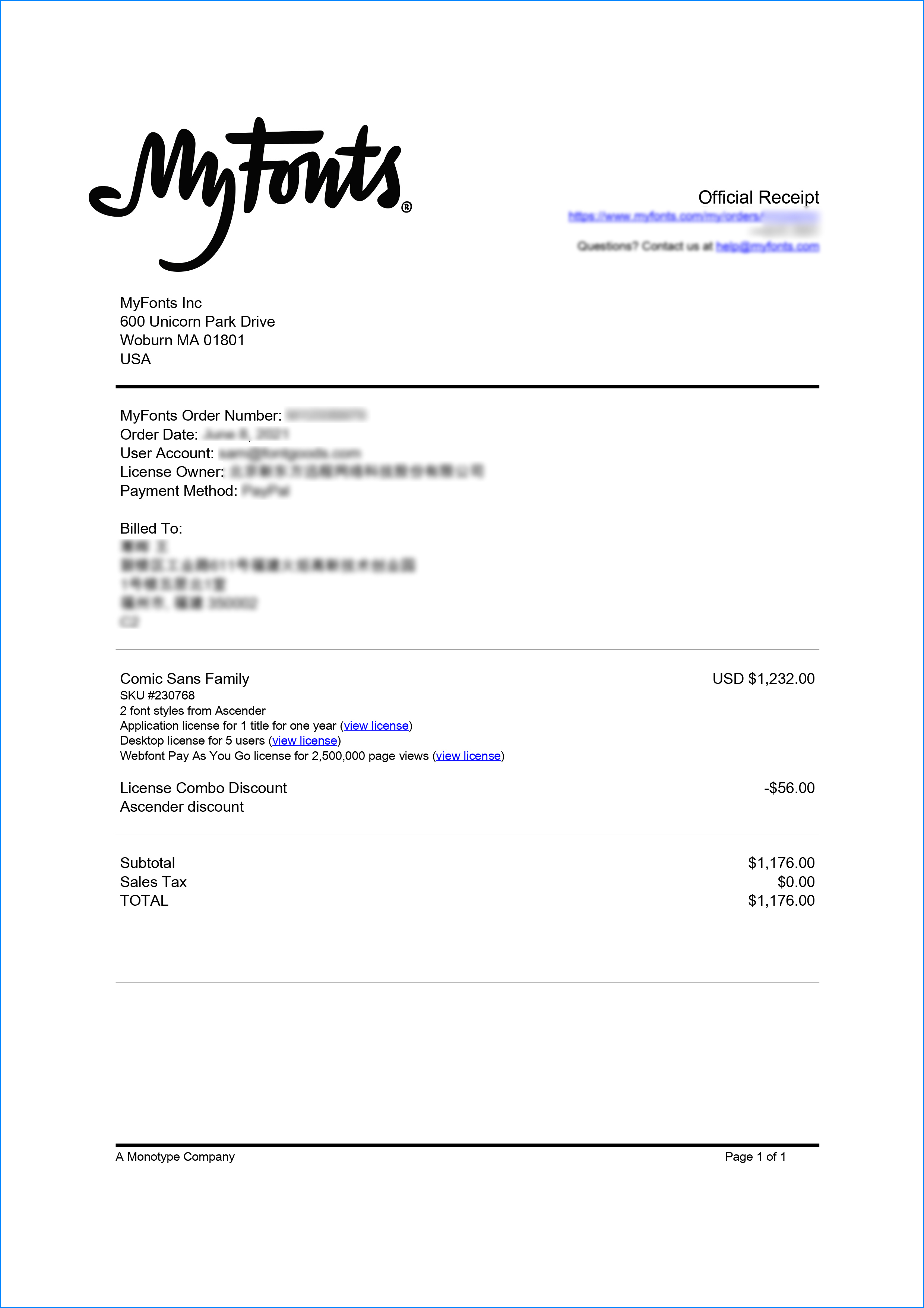
Formal invoice
Each order that generates actual payment can apply for issuing VAT invoice online.
a
m
p
l
e

Invoicing process
1.Click "apply for invoicing" in the order list
2.Select or add your invoice header
3.Submit application
Invoice type
1. 增值税普通发票,税率:1%
2. 增值税专用发票,税率:1%
Invoice content: information technology service fee
注:电子发票发送到您的电子邮箱,电子票据与纸质票据具有同等法律效力。
Question
1.What should I do if the purchased goods have been taken down or there is currently no price available
The appearance of prompts such as "The purchasing party's product has been delisted", "There is currently no price", and "Updating price" on the purchasing agent's product page is due to a remote server reading failure. Please contact online customer service or WeChat customer service at 18610955775 for a detailed quotation
2.Common licensing methods for overseas fonts
Desktop License (Desktop)
"Desktop" refers to the computer, the desktop license allows you to install the fonts on your computer for offline design purposes, including the design of logos, posters, merchandise, magazines, etc. For example, the static images you design with fonts on your computer are allowed to be distributed at will (regardless of online or offline use); however, you cannot embed the fonts in any form. However, the font file cannot be embedded in your work in any form, that is to say, the font file cannot leave your computer, for example, it is not allowed to convert the font format and embed it in web pages or embed it in PPT and then distribute it; it should be noted that some copyright holders may additionally stipulate that the font is not allowed to be used for the design of LOGO and other specified purposes.
The license is usually licensed according to the number of users, the number of users refers to the number of computers that may have the font installed; the desktop license is generally valid for life, if there is a specified number of years our purchase page will be prompted; the works designed within the validity of the license can be used for life, but if you need to continue to use the font for design outside the validity of the license, you need to purchase a new license.
Webfont
As the name implies, webfont license is a kind of license that allows font files to be embedded into various web pages. Regardless of whether the font files are converted or not, and regardless of whether the font files are fully embedded or partially embedded, the license is required for any form of font files embedded into web pages.
Different copyright holders have different ways of selling web page licenses. In addition to the license period, they usually specify the total number of views or monthly views within the license period, you can choose to purchase according to your website needs.
Application License (App)
App license allows you to embed the font file into the APP you develop or operate, no matter it is game APP, education APP, music APP, any APP that embeds the font file needs to obtain the license.
Application license can be sold in various forms according to the license period, installed volume, APP quantity, etc.
E-book License (ePub)
The ePub license allows font files to be embedded in an electronic publication, but the font software cannot be installed in the operating system running the electronic publication.
This license can be sold in various forms such as license period, number of titles, total number of devices, and number of views.
Server License (Server)
The Server license allows you to install fonts on the licensed server in a way that they cannot be extracted, but not on any other computer or processing unit.
This license can be sold in various forms according to the license term, number of CPU cores, number of clients, etc.
Digital Ads License (Digital Ads)
The Digital Ads license allows you to access, download, and use the Web fonts provided in the Web Font Kit to create digital ads, but only for the purpose of publishing digital ads on the output device.
The license can be sold in a variety of formats based on license duration, number of releases, number of exposures, etc.
Translated with www.DeepL.com/Translator (free version)
3.When does the authorization of a substitute order take effect?
After you complete the payment, the service provider will procure the relevant authorization for you in the first time, and the authorization process will usually be completed within 24 hours. After the procurement is completed, you can view the authorization voucher in the order details and download the font file or apply for invoicing.
4.Advertising agency for the client design work by who to buy font license
Usually the "licensee" of font software license should be the end-user of the design solution, so the owner of the design solution must obtain the relevant authorization of the font used, and some authorization methods (such as desktop license) specify the number of terminals to be used, so all computers using the font for design or modification of the solution need to obtain authorization.
5.How to help customers buy licenses
You can select or add "Licensee" information when you submit your order, and fill in your customer information in the "Licensee" form.
6.How to install fonts
Windows system: Copy the font file directly to C:/Windows/Fonts, or right-click the font file and select "Install"; Mac system: Double-click the font file - click Install, or open "Applications "-"Font Book", drag the fonts into it.
7.How to find the font in PS and other software after installation
Due to the operating system or software version, if you can't find the installed font in the software, we suggest you restart the system first, the font may be shown in the list as Chinese or English name, please look for it carefully, as long as the font is installed successfully, the font must exist in the font list.
8.What to do if there is a risk warning during the payment process
When using WeChat, Alipay and other third-party payment tools to make large payment, risk prompts may be triggered. Please operate according to the following methods. You can also pay large orders through corporate transfer<


 京公网安备11010802038756号