

 Genuine commercial
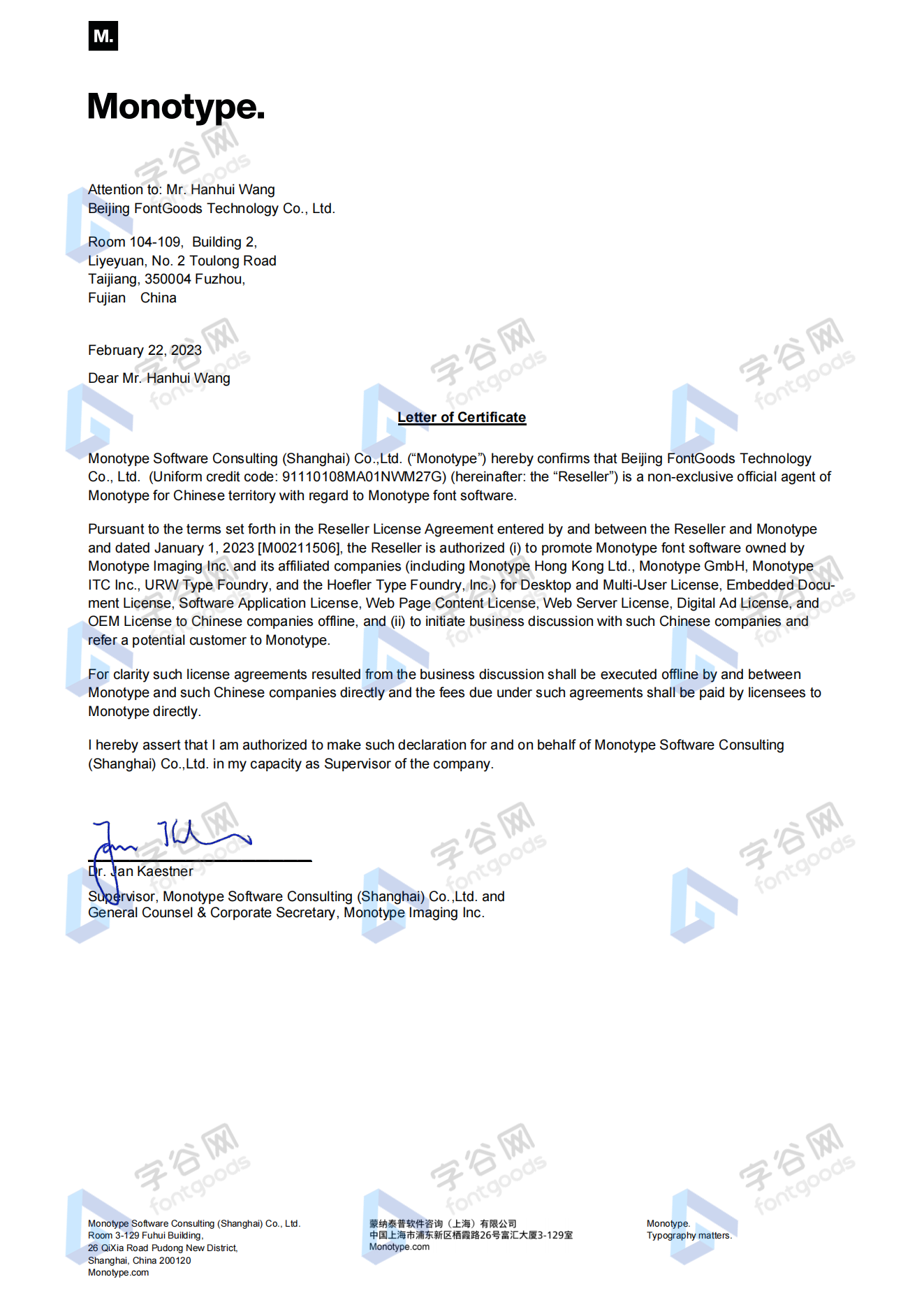
 Official authorization
 Formal invoice
3 working days
Formal invoice
3 working days 
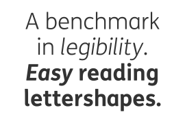
Font description
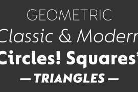
Pure and not-so-simple
Maybe it’s the air of purity, openness and transparency that they transmit, but geometric typefaces are more popular than ever among leading brands. Based on near-perfect circles, triangles and squares, geometric letterforms look uncomplicated, even though making them readable is anything but – something the designers of the first wave of geometric fonts discovered nearly a century ago. Many of the world’s most recognisable brands in technology, retail, travel, food, manufacturing and other industries continue to be drawn to the straightforward, honest character that geometric fonts convey.
Fontsmith set out in 2015 to develop a typeface in the same tradition, but optimised for the demands of modern brands – online and offline usage, readability and accessibility. And, of course, with the all-important Fontsmith x-factor built in. FS Lucas is the bold and deceptively simple result.
Handle with care
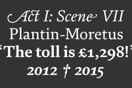
The letterforms of FS Lucas are round and generous, along the lines of Trajan Column lettering stripped of its serifs. But beware their thorns. Their designer, Stuart de Rozario, who also crafted the award-winning FS Millbank, wanted a contrast between spiky and soft, giving sharp apexes to the more angular letterforms, such as A, M, N, v, w and z.
Among his inspirations were the colourful, geometric compositions of Frank Stella, the 1920s art deco poster designs of AM Cassandre, and the triangular cosmic element symbol, which led him to tackle the capital A first, instead of the usual H. The proportions and angles of the triangular form would set the template for many of the other characters. It was this form, and the light-scattering effects of triangular prisms, that lit the path to a name for the typeface: Lucas is derived from lux, the Latin word for light.
Recommended reading
Early geometric typefaces were accused of putting mathematical integrity before readability. FS Lucas achieves the trick of appearing geometric, while taking the edge off elements that make reading difficult.
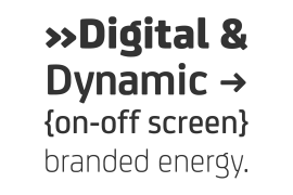
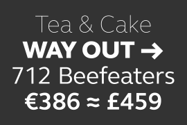
Perfectly circlular shapes don’t read well. The way around that is to slightly thicken the vertical strokes, and pull out the curves at the corners to compensate; the O and o of FS Lucas are optical illusions. Pointed apexes aren’t as sharp as they look; the flattened tips are an essential design feature. And distinctive details such as the open terminals of the c, e, f, g, j, r and s, and the x-height bar on the i and j, aid legibility, especially on-screen.
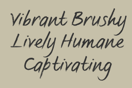
These and many other features, the product of sketching the letterforms in the first instance by hand rather than mapping them out mechanically by computer, give FS Lucas the built-in humanity and character that make it a better, easier read all-round.
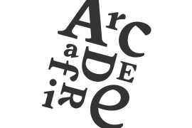
Marks of distinction
Unlike some of its more buttoned-up geometric bedfellows, FS Lucas can’t contain its natural personality and quirks: the flick of the foot of the l, for example, and the flattish tail on the g and j. The unusual bar on the J improves character recognition, and the G is circular, without a straight stem. There’s a touch of Fontsmith about the t, too, with the curve across the left cross section in the lighter weights, and the ampersand is one of a kind.
There’s a lot to like about Lucas. With its 9 weights, perfect proportions and soft but spiky take on the classic geometric font, it’s a typeface that could light up any brand.
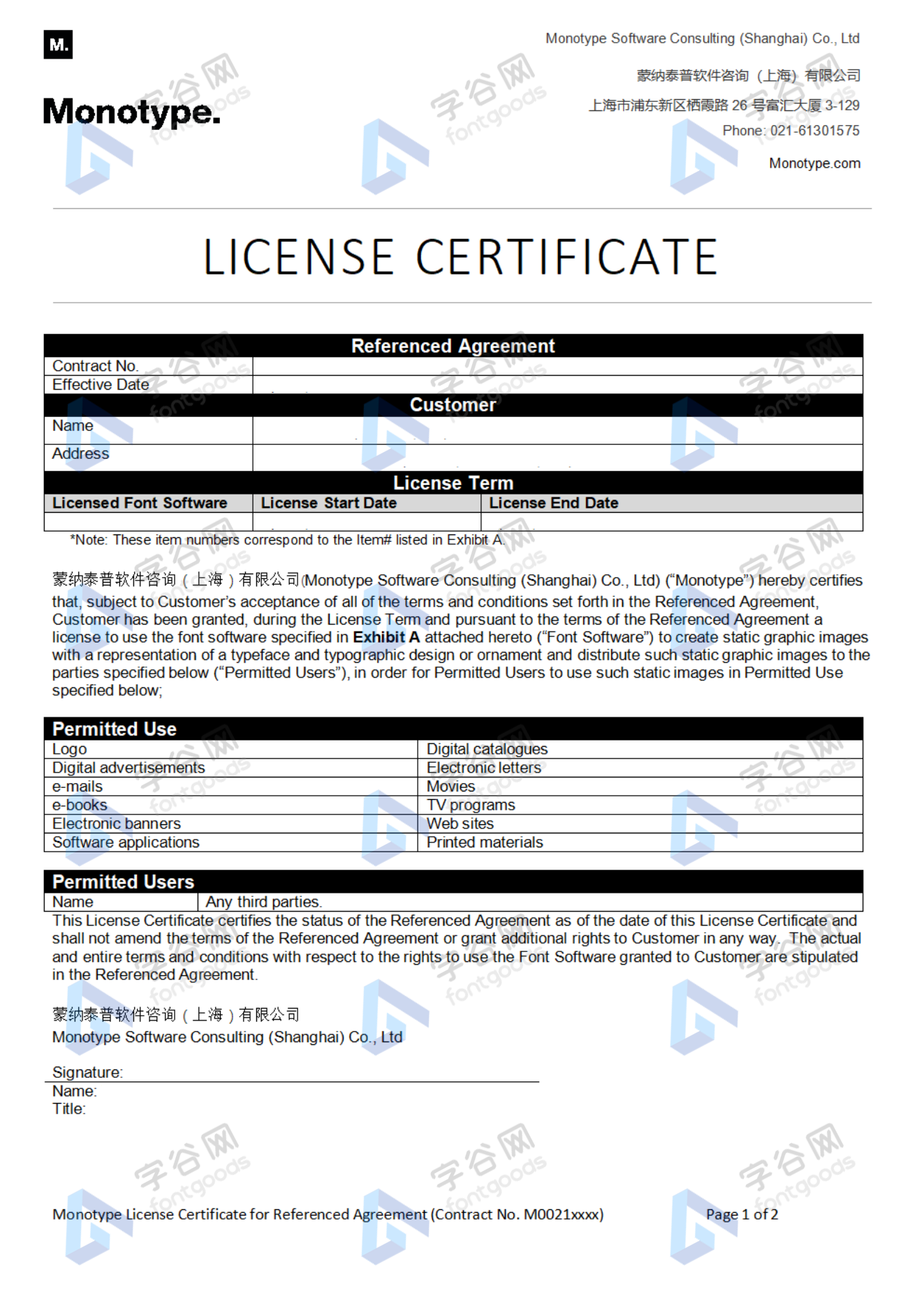
License type
|
License name
|
License description
|
license agreement
|
|
|---|---|---|---|
|
Desktop
|
桌面授权
|
Authorization process
Offline authorization
Official authorization
All fonts in our store are authorized by Monotype to be sold on behalf of www.fontgoods.com
Proof
Monotype官方出具授权证明
Formal invoice
Each order that generates actual payment can apply for issuing VAT invoice online.
a
m
p
l
e

Invoicing process
1.Click "apply for invoicing" in the order list
2.Select or add your invoice header
3.Submit application
Invoice type
1. 增值税普通发票,税率:6%
2. 增值税专用发票,税率:6%
Invoice content: information technology service fee
注:电子发票发送到您的电子邮箱,电子票据与纸质票据具有同等法律效力。
Question
1.Advertising agency for the client design work by who to buy font license
Usually the "licensee" of font software license should be the end-user of the design solution, so the owner of the design solution must obtain the relevant authorization of the font used, and some authorization methods (such as desktop license) specify the number of terminals to be used, so all computers using the font for design or modification of the solution need to obtain authorization.
2.How to help customers buy licenses
You can select or add "Licensee" information when you submit your order, and fill in your customer information in the "Licensee" form.
3.How to install fonts
Windows system: Copy the font file directly to C:/Windows/Fonts, or right-click the font file and select "Install"; Mac system: Double-click the font file - click Install, or open "Applications "-"Font Book", drag the fonts into it.
4.How to find the font in PS and other software after installation
Due to the operating system or software version, if you can't find the installed font in the software, we suggest you restart the system first, the font may be shown in the list as Chinese or English name, please look for it carefully, as long as the font is installed successfully, the font must exist in the font list.
5.What to do if there is a risk warning during the payment process
When using WeChat, Alipay and other third-party payment tools to make large payment, risk prompts may be triggered. Please operate according to the following methods. You can also pay large orders through corporate transfer<


 京公网安备11010802038756号